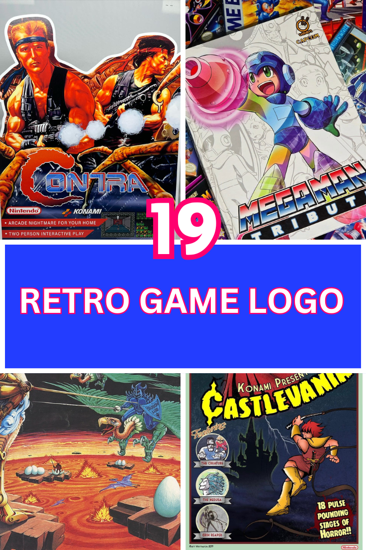
Step back in time to the golden era of gaming when video games weren’t just about intricate graphics and immersive worlds, but also about the iconic branding that defined them. From the first arcade hits to home consoles, these games introduced characters and logos that would be etched into the memories of millions. While many of us have moved on to the latest and greatest in gaming, it’s hard not to feel a sense of nostalgia when we see those old-school logos that made us feel like part of something revolutionary. Today, we’re diving into 19 retro game logos you totally forgot about—those retro emblems that defined a generation of gamers. Whether you’re in your 20s, 30s, 40s, or beyond, these logos will spark memories of childhood arcades, home console marathons, and countless hours spent with friends in front of the TV. So, let’s take a trip down memory lane and revisit some of these timeless logos that still hold a special place in our hearts.
1. Atari – The Pioneer of the Arcade Era
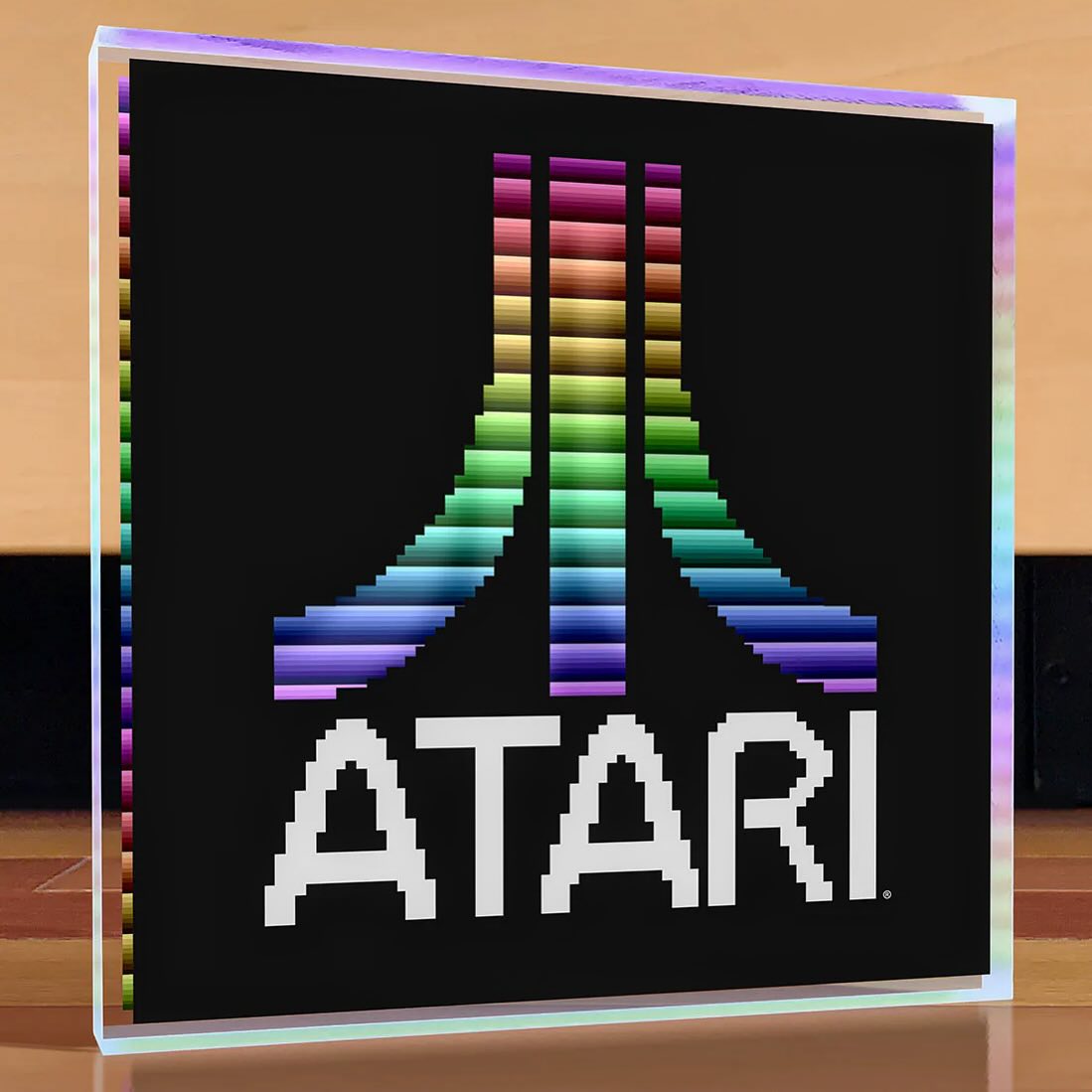
source @artovision3d
Atari, one of the most influential companies in the early days of video gaming, introduced its now-iconic logo in the late 1970s. The simple, sharp, and immediately recognizable “Fuji” symbol was part of Atari’s distinctive branding. This logo became a hallmark of the early video game industry, symbolizing the innovation and excitement that came with the launch of their games and consoles. Atari’s influence extended far beyond just the games themselves; it played a pivotal role in making video gaming a household activity. The simplicity of the logo reflected the accessible nature of Atari games, from the early Pong to the more complex adventures on the Atari 2600. Even now, seeing the Atari logo sparks nostalgia for an era when gaming was a fresh, new experience. For many, Atari was not just a game—it was the beginning of an industry that would evolve into something massive.
2. Nintendo – The Reign of Mario and Friends
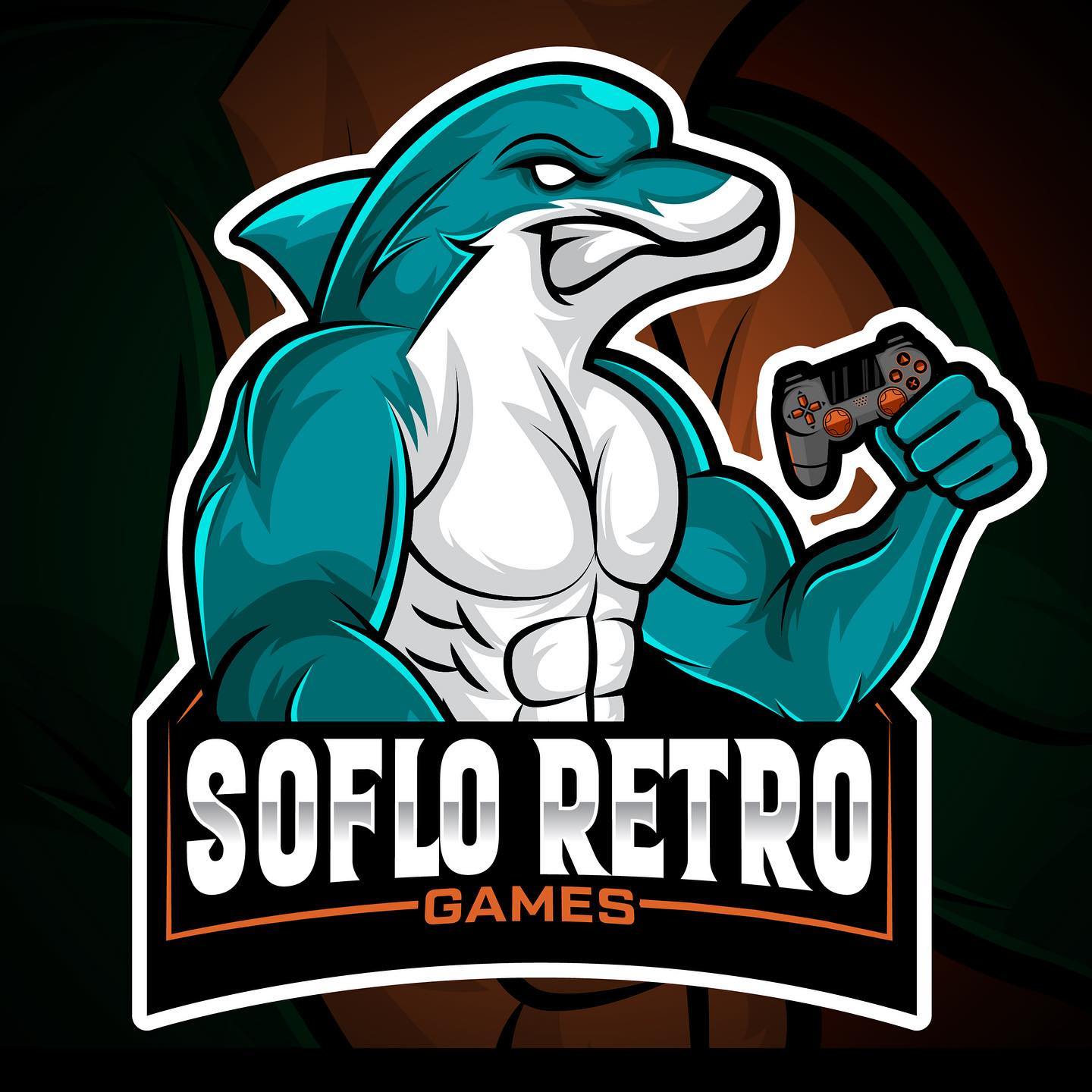
source @sofloretrogames
Nintendo’s logo has undergone several transformations over the years, but the one thing that has remained constant is its association with some of the most beloved gaming franchises. From Super Mario to Zelda, the Nintendo logo has always been tied to magic and adventure. The red-and-white Nintendo logo first appeared on the Nintendo Entertainment System (NES) in the 1980s, signaling the arrival of a true gaming titan in American homes. It became synonymous with the fun, whimsical adventures that players would embark on in the fantastical worlds of the Super Mario Bros. series, the puzzle-solving quests of Zelda, and the thrilling battles of Metroid. The iconic font and bright colors have become part of pop culture. The enduring nature of the logo showcases the brand’s evolution, especially with the advent of the Nintendo Switch, but the retro appeal remains. The NES was the beginning of something bigger, and Nintendo’s logo remains at the forefront of modern gaming.
3. Sega – A Logo that Screamed Power
source @find_designn
Sega’s bold, blue logo left an undeniable mark on the gaming world, especially during the ’90s. This logo was the face of some of the most influential gaming consoles of all time, from the Genesis to the Dreamcast. During this time, Sega built its reputation as a fierce competitor to Nintendo, and their logo served as a banner for action-packed, sometimes edgier games like Sonic the Hedgehog, Streets of Rage, and Shinobi. The strong font, the blue color scheme, and the sweeping lines made the logo feel powerful and dynamic, which perfectly matched the fast-paced action games that became a hallmark of Sega. It’s a logo that not only represents a company but an era of gaming where speed, attitude, and personality ruled the day.
4. Pac-Man – A Simpler Time
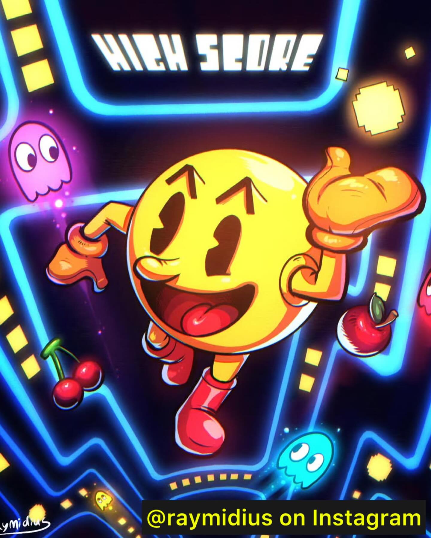
source @retro_game_nova_robj
Few logos are as universally recognized as the Pac-Man logo. The simple yet effective design, with a yellow circle representing the iconic Pac-Man character, remains an enduring symbol of early video gaming. Released in 1980, Pac-Man was more than just a game—it was a cultural phenomenon. Its success introduced gaming to a wider audience, including women, who became just as enchanted by the game’s simplicity and charm. The logo’s minimalist design reflected the game’s straightforward yet captivating premise: eat dots, avoid ghosts, and score points. The bright yellow and black color contrast made the logo stand out in the arcades and became ingrained in the visual language of the ’80s. Even today, Pac-Man holds a cherished place in the world of retro games.
5. Street Fighter – Fighting to Win with Style
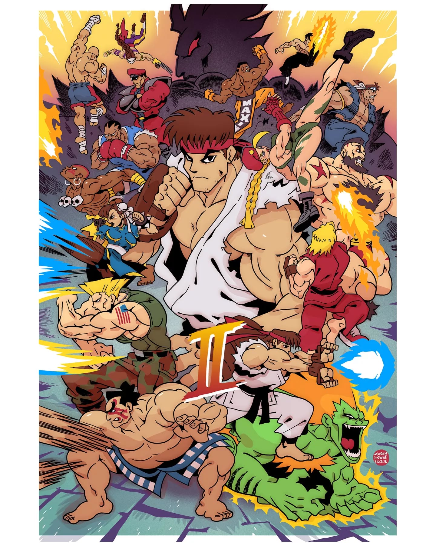
source @okcoreyyy
The Street Fighter logo, with its angular, aggressive typography, screams intensity—just like the game. As one of the most iconic fighting game franchises ever created, Street Fighter helped define competitive gaming in the ’90s. With characters like Ryu, Ken, Chun-Li, and Guile, Street Fighter introduced players to a vibrant world of martial arts, and its logo became synonymous with high-stakes combat. The logo’s sharp, jagged font captures the spirit of the franchise perfectly: action, power, and precision. It wasn’t just about the gameplay but about mastering combos, strategizing, and duking it out with friends in epic battles. The logo became instantly recognizable in arcades and at home, where Street Fighter was a favorite for players of all skill levels.
6. Donkey Kong – The Ape with a Legacy
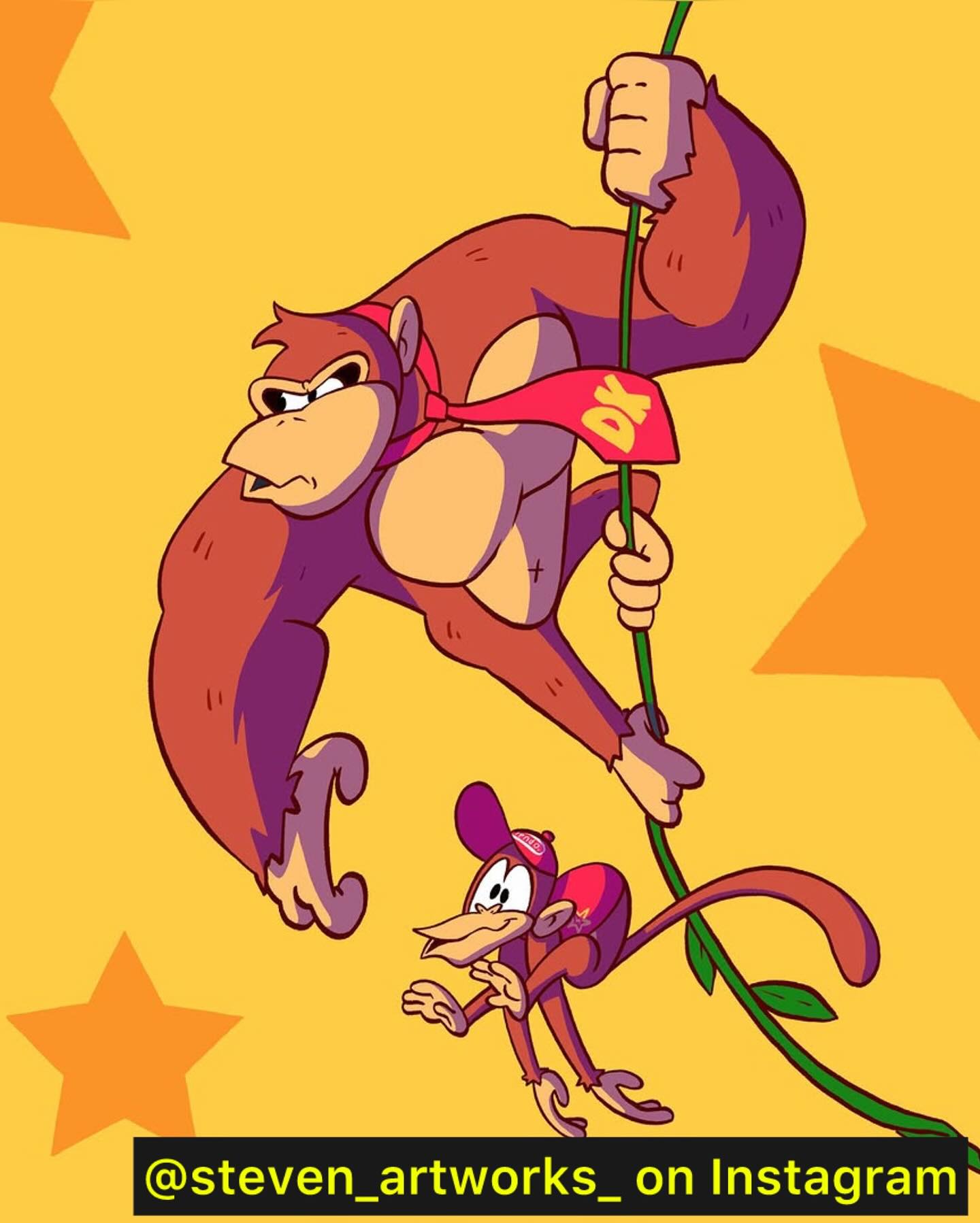
source @retro_game_nova_robj
The Donkey Kong logo has always been synonymous with the thrill of arcade gaming. As one of the earliest games created by Shigeru Miyamoto (the mastermind behind Super Mario), Donkey Kong introduced players to the iconic ape who would go on to become one of Nintendo’s most beloved characters. The logo, featuring bold, red letters and simple graphics, conveyed the playful yet challenging nature of the game. The premise was simple: navigate platforms and dodge barrels thrown by the mischievous Donkey Kong. While the game may have been simple, the logo’s design was effective, capturing the fun and intensity of the arcade experience.
7. Mega Man – The Blue Bomber’s Signature
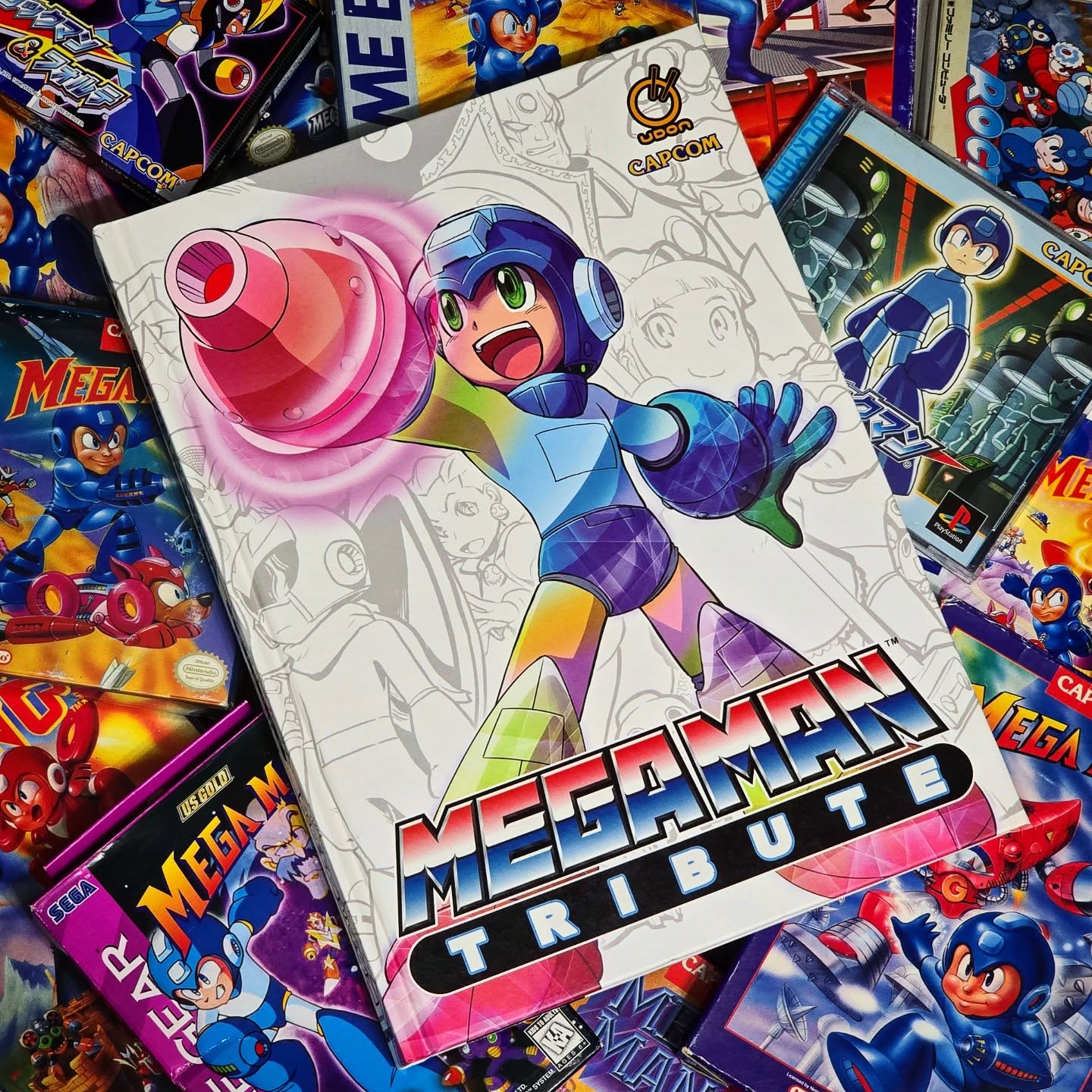
source @okami_ga_kill
Mega Man’s logo, with its bold blue font and stylized bomb icon, reflects the futuristic and action-packed nature of the game. Known as the Blue Bomber, Mega Man became a symbol of innovation in the 8-bit era, offering a blend of platforming action and shooting mechanics. The logo’s design evokes a sense of movement, energy, and determination, much like the titular character himself. From battling robot masters to collecting their powers, Mega Man provided a unique gameplay experience that kept players coming back for more. The logo remains one of the most iconic in retro gaming.
8. Castlevania – A Gothic Classic
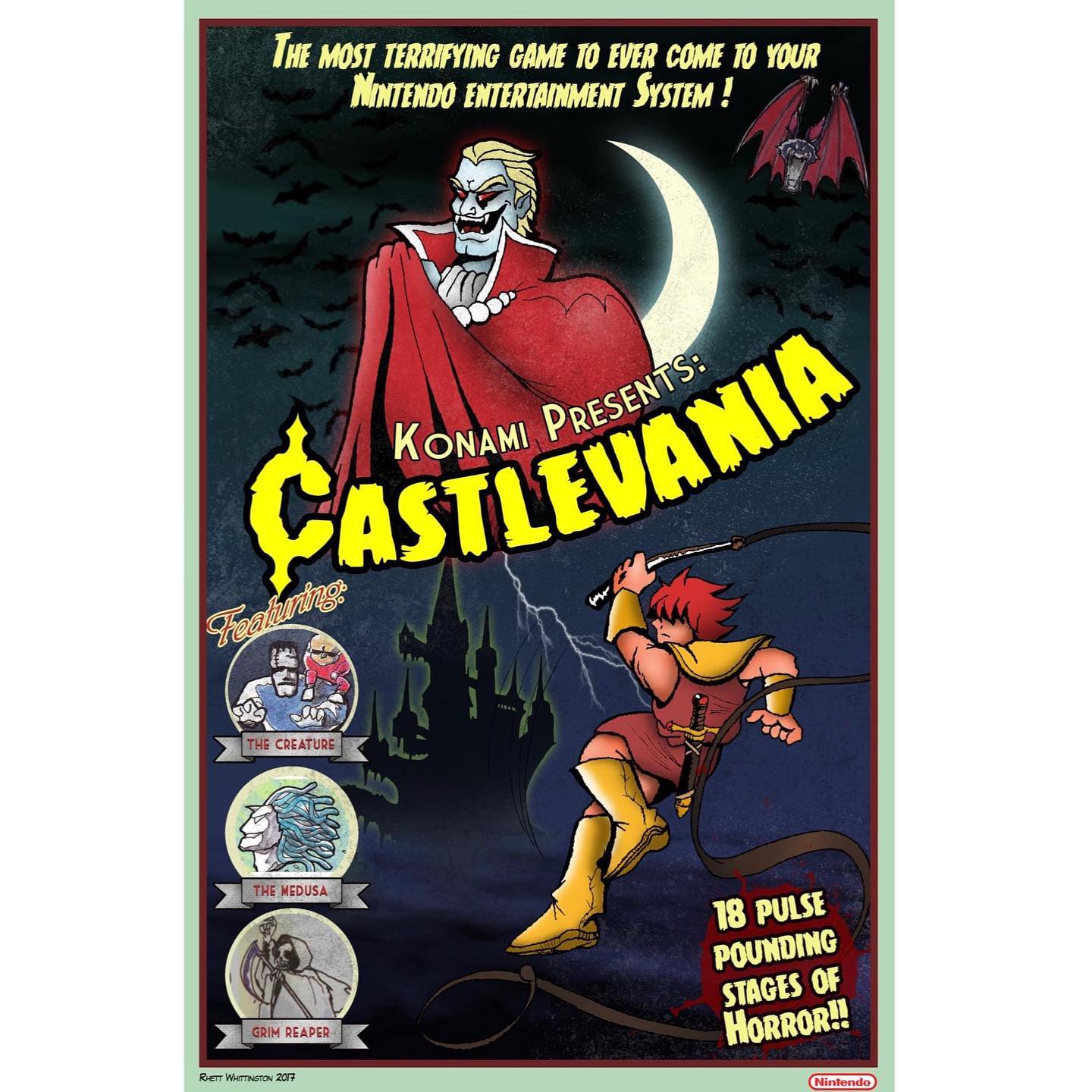
source @castlevania.fans
The Castlevania logo stands out with its Gothic flair, capturing the essence of the game’s eerie world. Castlevania was a pioneer in the action-platformer genre, and its logo reflected the dark, supernatural world players would find themselves in as they hunted down Dracula and his minions. The sharp, elegant font and dark color scheme were as much a part of the game’s mood as its challenging gameplay. The Castlevania logo has since become a symbol of the horror-action genre, which still influences games today.
9. Contra – The Ultimate Action Game
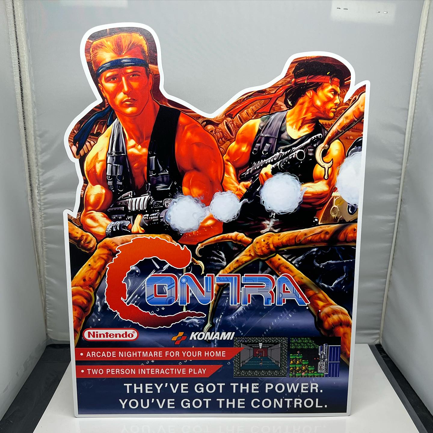
source @game_sharkz
When you think of Contra, you think of non-stop action, intense gunfights, and two-player cooperative play. The logo itself, with bold, red letters and sharp angles, captures the game’s relentless pace and urgency. Released in 1987, Contra became one of the quintessential arcade shooters. The logo embodied the tough-as-nails action where players had to battle their way through hordes of enemies. It’s a logo that still triggers memories of heroic battles, pixelated explosions, and the iconic 30 lives cheat code (Konami Code). Contra wasn’t just a game; it was a challenge.
10. The Legend of Zelda – A Timeless Fantasy
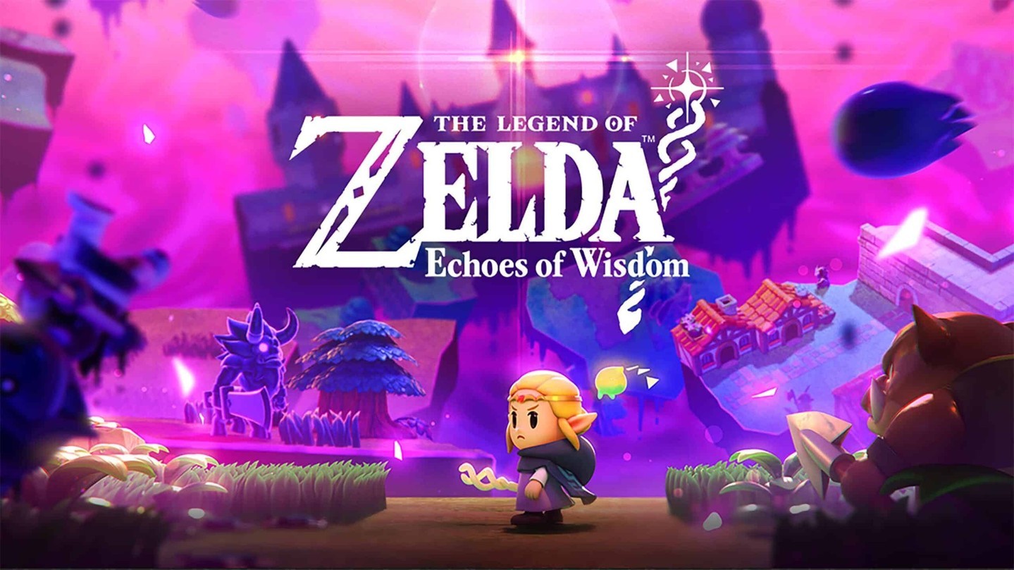
source @zeldauniversetv
The Legend of Zelda logo has long been associated with adventure, magic, and legendary quests. With its intricate font and iconic Triforce symbol, the logo represents not just a game, but an epic fantasy saga that has transcended generations. From Ocarina of Time to Breath of the Wild, the Zelda logo has remained an emblem of exploration, puzzle-solving, and the ongoing battle between good and evil. The shield-like shape of the logo gives it a sense of protection and strength, fitting for the hero, Link, as he journeys through Hyrule. The enduring popularity of the franchise, with its gorgeous landscapes and challenging dungeons, is reflected in the strength and history embedded in the logo’s design.
11. Mortal Kombat – Fight to the Finish
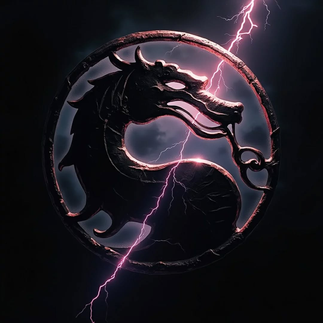
source @game_fight_2024
The Mortal Kombat logo, featuring the fierce dragon emblem, is as iconic as the game itself. With its dark and edgy design, the logo perfectly mirrors the brutal, fast-paced nature of the Mortal Kombat franchise. Released in the early ’90s, Mortal Kombat revolutionized fighting games with its digitized graphics, complex combos, and of course, its famous fatalities. The dragon logo became an indelible symbol of the game’s violent, yet strategic combat, and its inclusion in the game’s title screen made it immediately recognizable. The logo still brings to mind the fierce battles between characters like Scorpion, Sub-Zero, and Raiden.
12. Frogger – A Timeless Classic
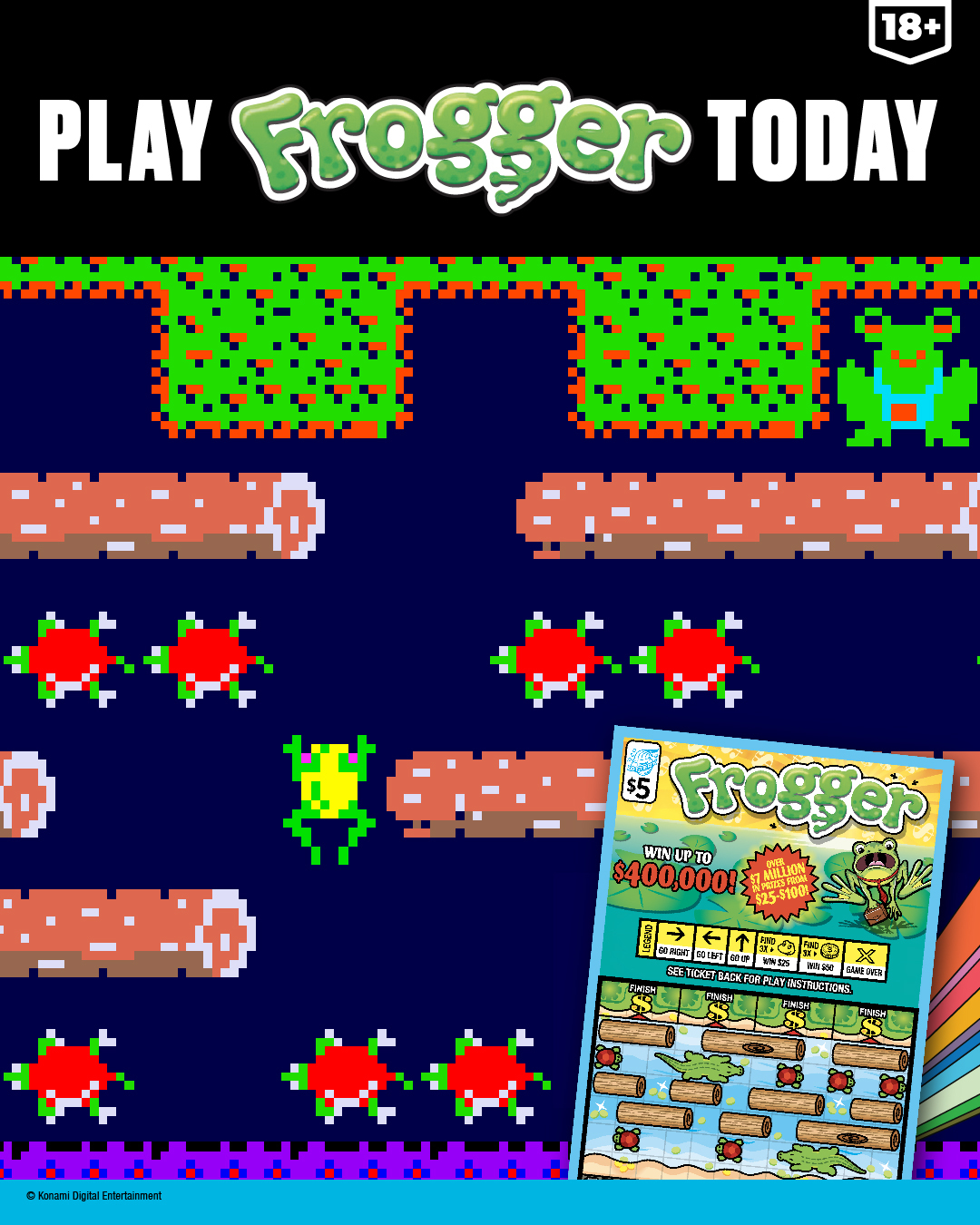
source @illinoislottery
The Frogger logo is as simple as the game itself, yet it has left a lasting impression on arcade lovers. Featuring the iconic frog, this logo evokes memories of navigating busy streets and dodging cars while trying to make your way to safety. Released in 1981, Frogger was one of the first action games that required players to think fast and strategize, making it a timeless classic. The logo’s simple yet vibrant design, paired with the green frog, made it easy for players to recognize and enjoy. Even today, Frogger remains a symbol of arcade gaming and nostalgia for those who spent countless hours hopping across roads and rivers.
13. Duck Hunt – Shoot ‘Em Down
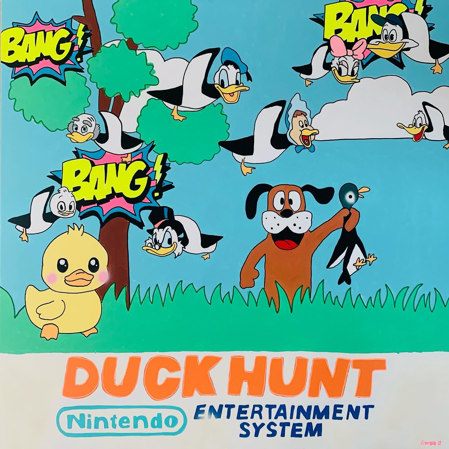
source @kgbell21
Duck Hunt was one of the first games to showcase the unique light gun accessory for the Nintendo Entertainment System. The logo, featuring a pixelated duck, perfectly encapsulates the game’s simple premise—shooting down ducks as they fly across the screen. Released in 1984, Duck Hunt became a family favorite, and its logo became a representation of casual gaming fun. The playful, green-and-yellow color scheme made it feel lighthearted, even if you were a bit frustrated by those seemingly impossible flying ducks. The game itself remains a nostalgic gem for retro gamers and a great reminder of the early days of gaming technology.
14. Galaga – A Space Shooter Legacy
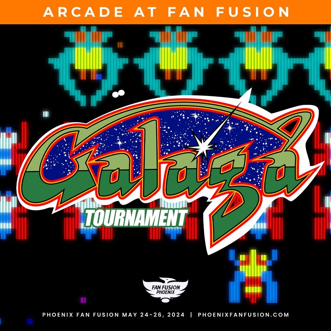
source @phoenixfanfusion
The Galaga logo, with its futuristic font and alien imagery, brings back memories of space invaders and intense action in the arcade. Released in 1981, Galaga was one of the first shoot ’em up games that allowed players to control a spacecraft and defeat waves of enemy aliens. The logo was the perfect reflection of the game’s fast-paced action, with sharp, angular lettering paired with an image of a space-faring hero battling against alien forces. The game’s popularity made it a mainstay in arcades, and the logo remains a symbol of classic space shooters to this day.
15. Pitfall! – The First Jungle Adventure
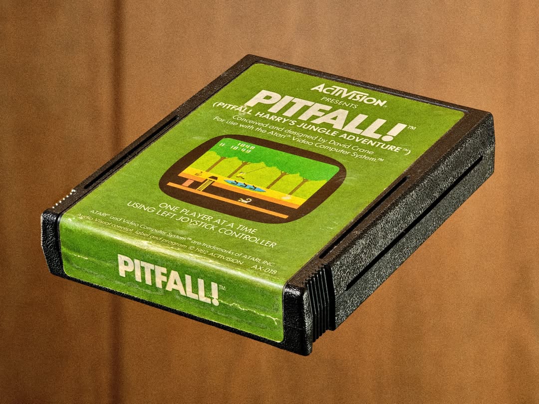
source @rob_williamson
The Pitfall! logo has been etched into the memories of those who played the classic adventure game on the Atari 2600. Featuring the brave adventurer Pitfall Harry, the logo’s bright colors and bold design conveyed the excitement and danger of exploring uncharted jungle territory. Released in 1982, Pitfall! was one of the first platform games to use scrolling graphics, allowing players to navigate through jungles filled with traps and treasure. The logo’s adventurous feel encapsulated the spirit of the game, and it became synonymous with the early days of action-adventure gaming.
16. Dragon’s Lair – The Hand-Drawn Masterpiece

source @dragonslaircomics
Dragon’s Lair was a groundbreaking game for its time, utilizing laserdisc technology to create hand-drawn animation and cinematic gameplay. The logo itself, featuring the silhouette of a dragon, perfectly captures the fantasy adventure the game promised. Released in 1983, Dragon’s Lair was a pioneer in the interactive movie genre, and the logo’s elegant design reflected the high-quality animation that set it apart from other arcade games. While the game was challenging and often unforgiving, its unique visual style and the bold logo left a lasting impact on gamers.
17. Dig Dug – Digging for Fun
source @nostalgicvideogames
The Dig Dug logo, with its bright and playful design, represents one of the most fun and unique arcade games of the early ’80s. The game’s premise was simple—dig tunnels, defeat enemies, and collect points—but its addicting gameplay made it an arcade staple. The logo’s cheerful colors and imagery of the titular character digging underground reflect the whimsical nature of the game. Released in 1982, Dig Dug was a departure from traditional action games, and its quirky gameplay made it a fan favorite. The Dig Dug logo still evokes the feeling of childhood arcade days, filled with fun and friendly competition. Recommended Product: For fans of Dig Dug, Amazon has a great selection of retro merchandise, including t-shirts, hats, and even Dig Dug themed puzzles.
18. Q*bert – The Square World of Gaming
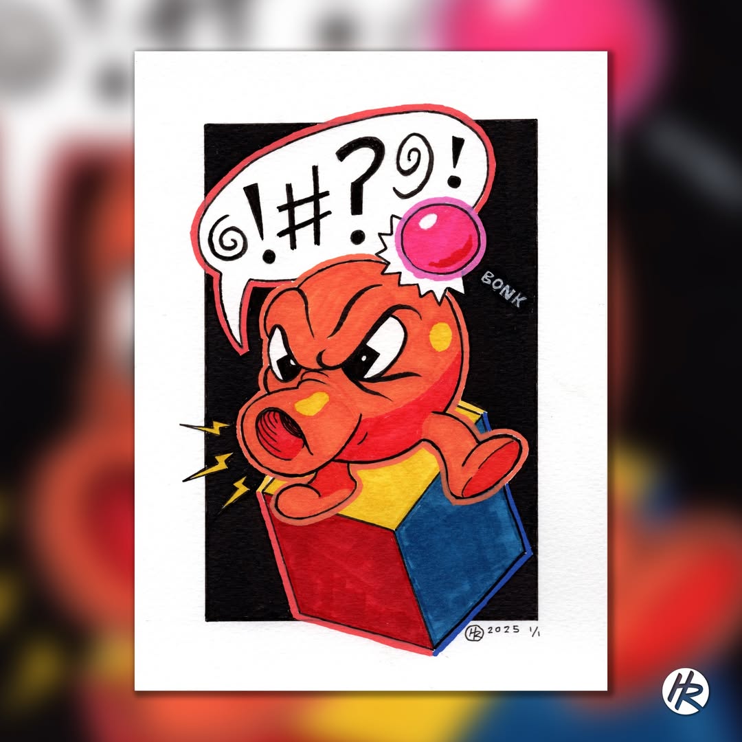
source @henryrose_design
The Qbert* logo, with its geometric design and quirky character, perfectly matches the bizarre, cube-hopping gameplay that made it a hit in arcades. Released in 1982, Qbert* had players hopping around a pyramid of cubes while avoiding enemies and obstacles. The game’s logo, featuring the orange, snout-wearing character, has become iconic in its own right, representing an era when arcade games were as fun as they were simple. The design’s playful nature and bright colors made it instantly recognizable and helped Qbert* carve out a lasting place in retro gaming history.
19. Joust – A Game of Knights and Birds
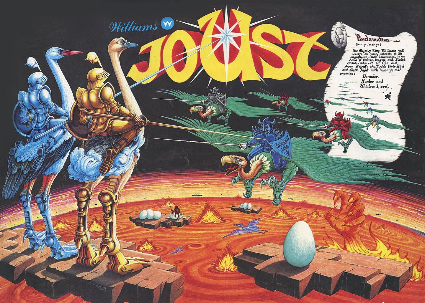
source @bugbearbrothers
The Joust logo, featuring the image of a knight riding a flying ostrich, is as quirky as the gameplay itself. Released in 1982, Joust was one of the first multiplayer arcade games that allowed players to engage in aerial battles with knights riding birds. The logo’s bold, medieval font and fantastical imagery made it stand out in arcades and cemented its place in the gaming pantheon. The whimsical nature of the game, combined with its unique mechanics, made Joust a beloved classic that continues to be celebrated today.